Project Overview
Objective
Representing a real project completed, but modified here with respect for confidentiality, this company-wide intranet was in desperate need of a complete overhaul. The previous design was outdated in terms of layout and responsiveness, cluttered beyond simple modifications, and bloated with old pages and convoluted navigation structures.
The new design had to serve the site’s original purpose: eliminate constant human contact for resources and questions and provide a self-service knowledge base where folks could access documentation, frequently asked questions, handbooks, guides, technical how-tos, and external links. This knowledge base had to surface what users were looking for most, cut down on clicks, and divert people away from contact links and toward the resources already available online. As soon as these resources felt accessible and well within reach rather than buried and confusing, the new intranet would be a success.
01
The Work
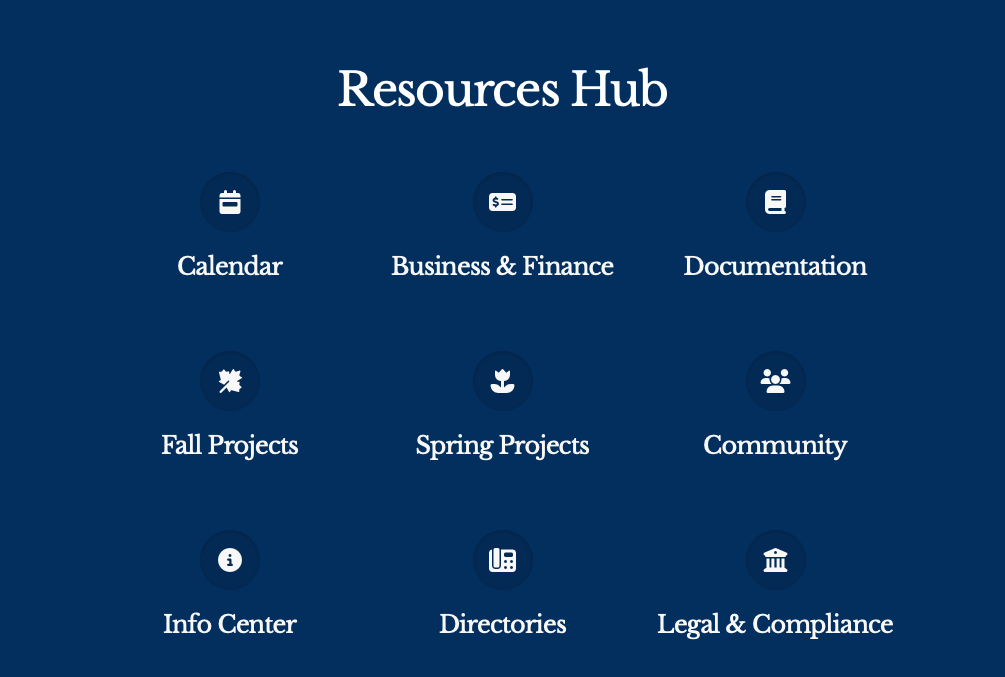
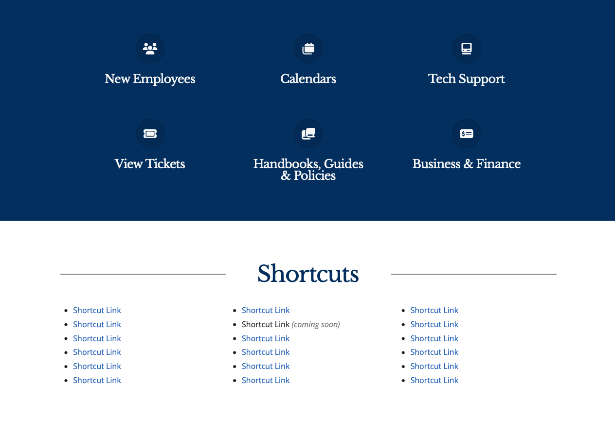
A two-year project requiring collaboration and feedback with nearly every department in the institution, the new intranet sprung to life with a fresh take on the look and functionality of a knowledge base and internal portal. The old laundry list of scrolling links and confusing hierarchy was totally removed and replaced by three main structures: the top navigation bar, the Favorites banner, and shortcut links. The navigation was condensed from over 30 items down to just seven. Instead, other common links and resources were put either in the Favorites section (the blue banner) or the shortcut links underneath.
Analytics showed that most people were spending little to no time on the home page, and instead were quickly jumping to the resource they needed at that time. That’s why the home page morphed into what it was destined to be: a place for easily branching out. These same analytics provided insight into what people were looking for most. That directly informed not only those shortcut links and favorites, but the entire navigational structure. It helped organize all of the site’s content into seven main categories that would live in the navigation bar. But since there’s still a wide breadth of company-wide information that could be buried within there, that’s where the favorites section comes in: six giant buttons linking to the most popular pages on the intranet. Point, blank, period. Underneath that, fifteen additional shortcut links for some of the less common but still very popular content. Everything else was relegated either to those seven categories, a brand new A-Z sitemap featuring every single page and file available on the portal, or the search function.
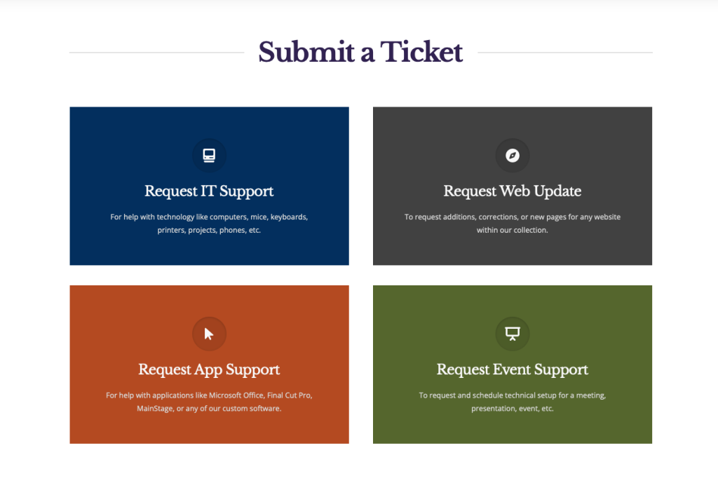
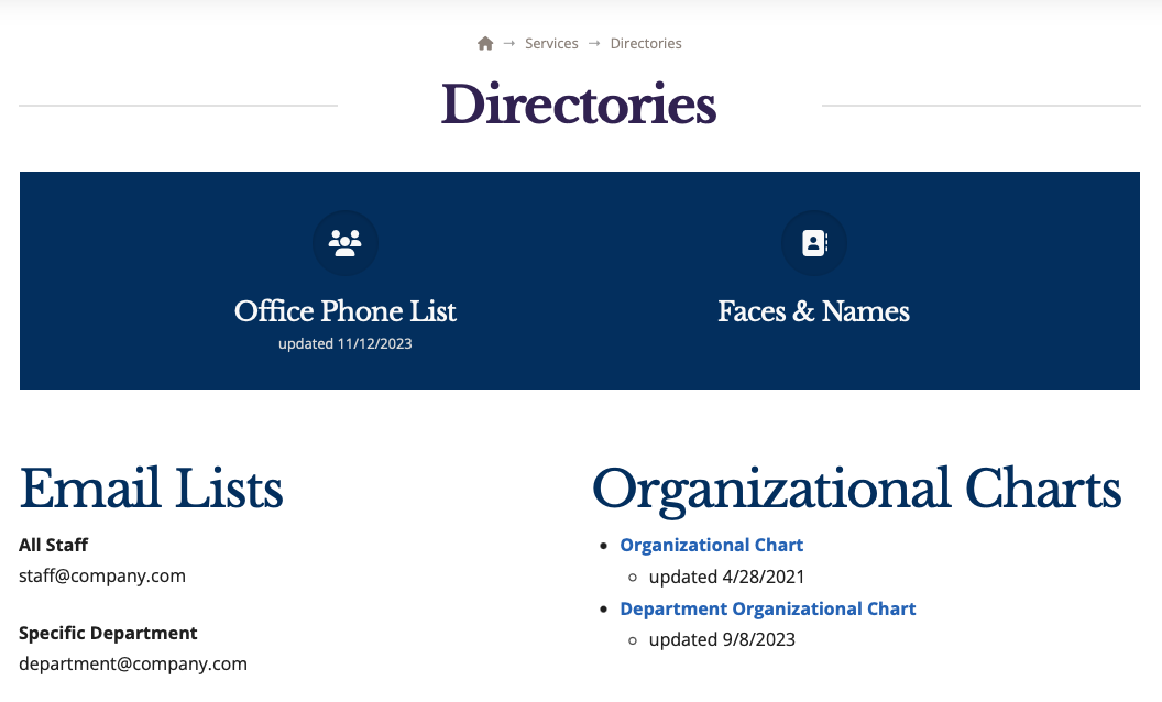
Aside from this rethinking, the new site was cleaner than ever. Responsive for the first time, it features a ton of white space, better nesting, clearly divided page sections, and an overall modern and approachable look in line with both strict brand guidelines and web accessibility.
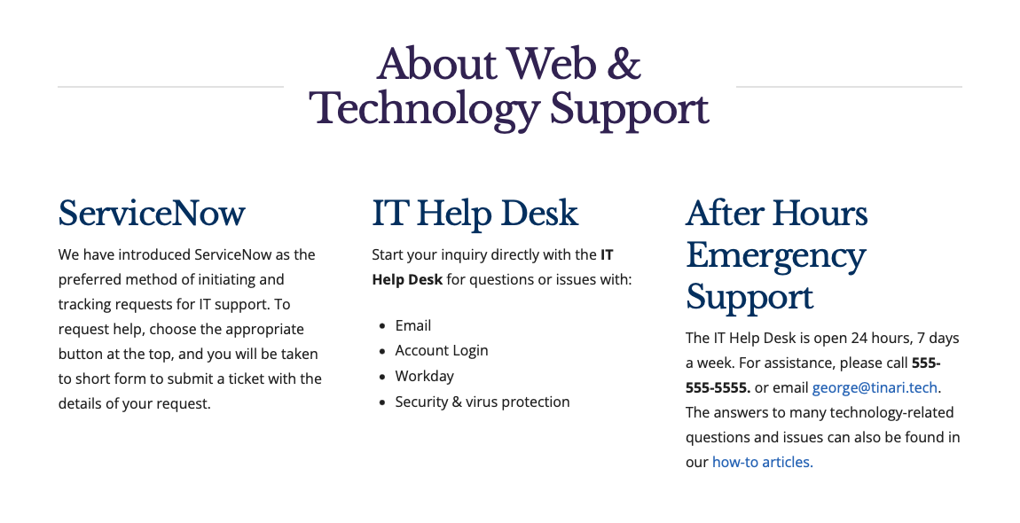
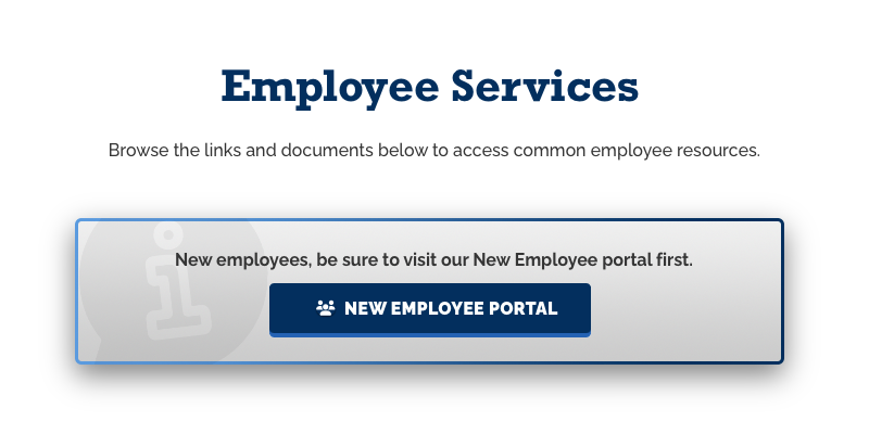
This one-man project didn’t stop there: the UX writing across the board served to convey a modern, friendly tone with clear, concise instructions for what to do next or how to get somewhere, as demonstrated throughout several of the screenshots on this page.
02
The Results
Company-wide praise was immediate for the new design as well as clear expressions and gratefulness for the reduced need of human guidance and intervention. Over 100 cluttered pages were reduced down to just over 20. Site responsiveness and usefulness skyrocketed. New language and navigation proved tremendously useful over the past design in tests and stakeholder reviews.
This lengthy one-man project became a labor of love that, like my other endeavors, aims to primarily elevate the user experience and provide a robust, advanced solution that feels light as a feather and smooth as clockwork.

